These are the estate agent photos for the living room. As you can see, the colour scheme is very brown, lots of wood, brown and cream paint, brown carpet, brown in the curtains… a very neutral, natural colour scheme. Not for me though. I’m definitely more of a grey girl when it comes to neutrals.
The house was originally a two-bed cottage and what’s now the living room with a dining area was previously a living room and kitchen. We had the dining table in the other half of the kitchen for the first few weeks, but now we’ve ordered a new dining table, we’ve decided it’s better the way they had it – with a living/dining room and kitchen/playroom.
We’ve decided to invest in a new grey sofa and some soft grey curtains for the living area. By keeping these neutral, it means we can update the paint colour if we like, and keep the same accessories. Bear in mind, our last sofa did us eight years and we’ve just moved it into the kitchen to continue its sentence. I’ll talk furnishings at a later date – this time, I want to just talk paint.
I knew straight away that I wanted this room to be blue. Everything that’s brown at the moment needs to be blue (apart from the skirts and the line round the fireplace – that needs to be white), it needs to carry on against the back wall to the dining area, and the cream is crying out to be an antique white. It will look clean and crisp, and will look great with the grey furnishings we’ve chosen. Choosing the shade of blue has been a whole other issue.
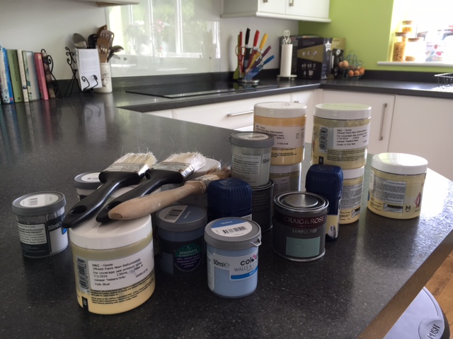
 I have a problem. My name’s Michelle, and I have an addiction… to paint tester pots. Especially Valspar ones, where they make it up in front of you. It started off with a bang – I bought three different blues for this room (along with more for different rooms). Then, when none of these seemed right, I bought four more. Just for the living room. The photo here is just a selection of what I’ve ended up buying (for three rooms, granted) – there are more hiding in the shed.
 Barry and I had different ideas of what this blue should be. I envisaged a dark blue with quite a lot of grey in it. Barry thought it should be dark, but not so much grey – he was worried about it leaning towards indigo, but I think it needs the grey to keep it looking “country” and not too modern.
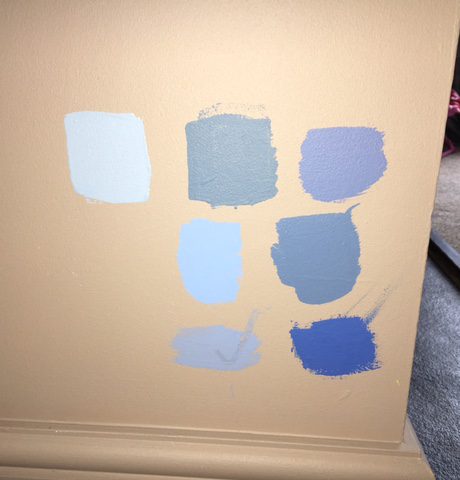
This was the reason for all the samples – trying to please two people with different ideas of what this blue should be meant testing a lot of different blues. And yes, I’m pretty sure Scarlett had her finger in those bottom two samples before they’d dried.
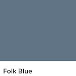
 I nonsensically painted the bottom two and the middle right first. Barry liked the bottom right (WHY?), which I vetoed – I liked the middle right (Valspar Folk Blue), but he wasn’t convinced, so I bought another four blues to try.
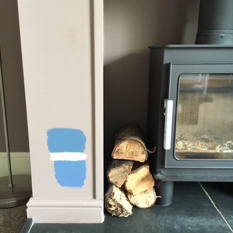
Having realised I’d painted the samples in the darkest corner of the room, we committed to trying two (both Valspar) in actual daylight – the top middle (Blue Embrace) and Folk Blue, and added some antique white to see how it would look. I would have been happy with either of these really, but we’ve gone with the top one here – Folk Blue.
 So, we’re committed now! No need to point out it’s to one of the original blues I tried; I’m aware. We’ve been out and bought the paint: blue, antique white and white eggshell; paintbrushes and rollers, and now we just need to crack on with the painting…


2 thoughts on “I got the blues”