One of my takeaways when we first came to see the house was that the extension had been done very seamlessly from the outside, but has a very modern feel inside compared to the older sections of the house.


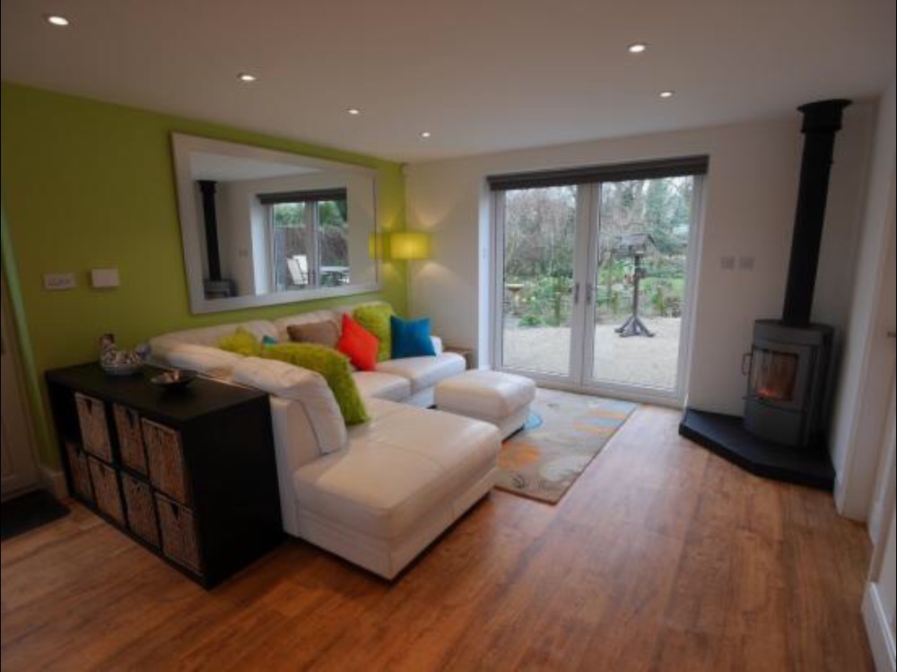
Without replacing the kitchen (which I would love to do, but can’t yet), a very easy way of toning down the modernity of that room would be to tone down that lime paint colour. I’d like a more sympathetic sofa in there too, but our old black and grey one is in there at the moment.
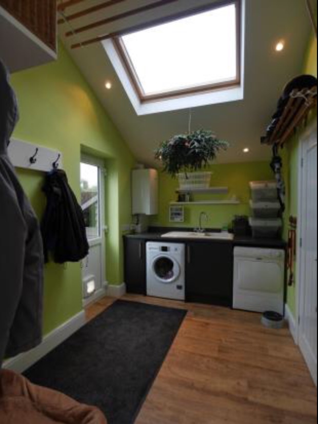 I had in mind a sage green for the kitchen, the utility room and the downstairs toilet (all currently painted in this vivid green), but after getting five samples from B&Q over three different visits and having no joy as they all looked grey, I started looking online at modern country colours.
I haven’t had any experience of Farrow & Ball before (I can hear the lads at work mocking me as I type this), but I found this article showing how F&B’s Green Blue can change in different lights, which I really liked, so ordered a sample. I had a similar problem in that it had a greyness to it, and thought it actually looked quite similar in shade to one of the first testers I picked up from B&Q’s own range, Colours.
I read up on how F&B paint has various pigments (justifying the price), so rather than a solid colour, you’re paying for this layering of colours. While that patch did change slightly throughout the day, moving between grey-green and green, it never did look blue to me at all, even though it’s not even listed amongst the greens on F&B’s own website.
After a few weeks of looking at the same splotches on the wall, inspiration struck and I covered the lime with my hands, which instantly lifted the greens I’d painted to a completely different shade – so much nicer than before. The photos below are of the same patch of wall, using the same camera, at the same time of day, just with a sheet of paper covering the lime paint surrounding it.
The F&B Green Blue is on the left where I painted on the horizontal in a shadowed area of the kitchen, and on the top in the vertical which is lit by natural daylight by the door – Eau de Nil from Colours is the other colour. You can see how covering that lime-coloured surround makes a massive difference to how the paint looks.


Considering that we’re wanting to paint a few walls in three rooms, Farrow & Ball really isn’t going to be kind to our pocket, as nice as the shade is. I think the Eau de Nil is actually a lovely shade once the lime is taken out of the equation, and am happy to plump for the Colours version – which also happens to be on offer at the moment, so is literally a quarter of the price.
One thought on “Hurts my eyes”